
Artist: Xiao Fan
Title: Resting on the River
Dimension:15.5 x 10.75
Media of each work: Watercolor
Why you chose it: So peaceful.
What about the reference image you can integrate: The integration of great looking fog.
Some interesting factoid about the artist(s): Is a Chinese orphan. He paints of his now gone village, which was flooded. He sells his paintings through a website that helps him survive.
Artist: Xiao Fan
Title: Fishermen in Guilin
Dimension: Same as the last one.
Media of each work: Watercolor
Why you chose it: Looks really nice.
What about the reference image you can integrate: The way it doesn’t look like watercolor but is.
Some interesting factoid about the artist(s): His village was destroyed by a flood.
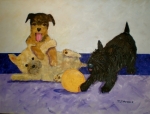
Artist:Sandra Merwin
Title: Playtime for Terriers
Dimension: 3 x 4
Media of each work: Watercolor
Why you chose it: I wanted to chose something else than a chinese village.
What about the reference image you can integrate: The popping of it.
Some interesting factoid about the artist(s): Another dog person.


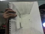
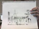
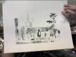
I will be truthful for this. At first, I didn’t care very much about this. I didn’t pay very much attention for the first day. However, once Mr. Nelson told us how he graded our work and how soon it was due, I actually tried my best to get it done. After a hiccup and restart, I focused on the church outline. Then, I started to due the details. I admit that this I did not do very well. I was too focused on finishing it on time. After that, I began the wall across the bottom. Then, seemingly on the last day, I barely finished the shading and a rough outline of the trees. However, the next day, Mr. Nelson was not there, so I finished up the details a little more, and shaded in the trees. I was happy at that point, but it could have been better.


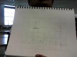
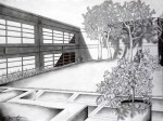
I was actually happy with my result this time. Well, somewhat. On the right side, it is pretty good, and gets progressively worse as you move left. This is because I started out on the back wall, then the right wall, and put off the left wall until the end. It looks like that too. Even the shading is too dark. I messed that part, especially. I wanted to make it more neat, but I couldn’t even accomplish that, so I just gave up. Otherwise, I really like the picture. It is almost perfectly rendered, and all of the lines in the middle and on the right are neat and nicely made. I think that this is one of my best works so far, since everything else was pretty bad. However, the glass case on the left side presented problems, and Mr. Nelson had to draw it for me. This is probably the first work that I can say that I actually like.
Artist: Andrew Diec
Title: Two Point
Dimension: Unknown
Media of each work: Unknown
Why you chose it: It looks like a style of anime.
What about the reference image you can integrate: Detail.
Some interesting factoid about the artist(s): Made amazing pic of robot with a 6b pencil.
Artist: Jan Vredeman de Vries
Title: Perspective Study
Dimension: Unknown
Media of each work: Pen and ink
Why you chose it: Shading’s pretty nice
What about the reference image you can integrate: Shading
Some interesting factoid about the artist(s): Lived in the 1600s
Artist: Laurissa Hughes
Title: Two Point Perspective House
Dimension: Unknown
Media of each work: Pencil
Why you chose it: Bad shading.
What about the reference image you can integrate: Failure to erase lines.
Some interesting factoid about the artist(s): Website sucks


.


When we first started drawing this picture with pencil, I thought that it would be a piece of cake. I drew a quick sketch, which was, for the most part, pretty good. The tower kinda made me mad, but I still was happy. I thought that the drawing was in the bag. I was dead wrong. Mr. Nelson then introduced us to the pen and ink, or as I knew it, Satan in the form of an art tool. I did a decent job on the first trees. This would be the best I would do on the picture. The rest of it was plagued by random splotches, splattered ink, and random lines. On top of that, many cross-hatchings I did horribly wrong and made too broad of lines. The whole roof itself was a mess. Also, the tree on the right side of the paper was a total failure. it was too small, had too many marks, and looked too much like a total mess.


Artist: David Martinez
Title: Campus
Dimension: 11×14
Media of each work: Pencil
Why you chose it: Highly detailed shading.
What about the reference image you can integrate: Style of shading.
Some interesting factoid about the artist(s): Named his website digication.
Artist: Preston Mojica
Title: One Point Perspective
Dimension: 8×10
Media of each work: Pencil
Why you chose it: It makes me wonder where it takes place.
What about the reference image you can integrate: The mysteriousness.
Some interesting factoid about the artist(s): He relies on art rising to potray his work.
Artist: Duffy Day
Title: One Point Room
Dimension: Unknown
Media of each work: Felt marker.
Why you chose it: It looks like a picture you color in.
What about the reference image you can integrate: Dark outlines.
Some interesting factoid about the artist(s): She also specializes in film.

Artist: Kelli Swan
Title: House in Ink
Dimension: 8×10
Media of each work: Pen and Ink
Why you chose it: It looks so freakin’ realistic.
What about the reference image you can integrate: The realism.
Some interesting factoid about the artist(s): Specializes in pencil drawings.
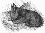
Artist: Kandy Radzinski
Title:Mr Watson with Teddy
Dimension: Unknown
Media of each work: Pen and Ink
Why you chose it: The dog is attacking an innocent teddy bear.
What about the reference image you can integrate: The use of a cute scene that would usually look great using a photo done in a style that defeats the cuteness.
Some interesting factoid about the artist(s): ALL OF HER WORK IS ABOUT DOGS.
Artist:Miller
Title: Three Stages of Man
Dimension: Unknown
Media of each work: Pen and Ink
Why you chose it: There is a skull in it.
What about the reference image you can integrate: The subject on futility of mankind.
Some interesting factoid about the artist(s): He forgot to renew the copyright on it and it is now in the public domain.


Ah, still life. The stupidest form of art ever created. This was my very first start as we began this gruesome assignment. I started with a brief sketching period, and thought I was pretty good. I was even more backed up when I looked at my neighbor’s picture and saw that theirs was no where near as good. Then I heard a commotion, and saw a masterpiece being created. I threw my eraser down in disgust, and went on to add shadow. I screwed up badly, and every thing looked “furry.” I nearly screamed at my drawing. I continued to add value, and Mr. Nelson came by and must of known that I screwed up because he helped me add value more correctly, and later got rid of the furriness. Later on, I took spme pictures of it and was not satisfied at all. When I was done, most furriness was gone, the shadows and value looked great, and I still hated still art.
| Mr. Nelson on One Point Perspective Resource… | |
| Mr WordPress on Hello world! |
